Ring Diagram Analysis
 |
 |
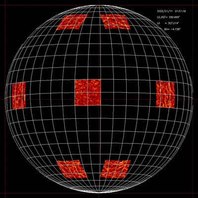
| In the so-called Ring Diagram analysis area of Solar doppler maps at different latitudes and longitudes are first tracked at their rotation rate and remapped. Each area thus produces a data-cube of remapped Doppler maps. |
These data-cubes are then 3D Fourier transformed. Cuts at given temporal frequencies of the resulting 3D power spectra looks like rings in the kx-ky plane that are distorted by the undelying flows at different sub-photospheric depths. |
Related publications
- "Meridional Circulation Variability from Large-Aperture Ring-Diagram Analysis of Global Oscillation Network Group and Michelson Doppler Imager Data", González-Hernández, I., Komm, R., Hill, F., Howe, R., Corbard, T. and Haber, D. A. ApJ. 638, pp. 576-583 (2006)
- "North South Asymmetry of Zonal and Meridional Flows Determined From Ring Diagram Analysis of Gong ++ Data", Zaatri, A., Komm, R., González-Hernández, I., Howe, R. and Corbard, T. Solar Physics 236, 227 (2006)
- "Ring Analysis of Solar Subsurface Flows and Their Relation to Surface Magnetic Activity", Komm, R., Howe, R., Hill, F., González-Hernández, I., Toner, C. and Corbard, T., ApJ. 631, 636 (2005)
- "Solar sub-surface fluid dynamics descriptors derived from Global Oscillation Network Group and Michelson Doppler Imager data", Komm, R., Corbard, T., Durney, B. R., Gonzáles-Hernández, I., Hill, F., Howe, R. and Toner, C., ApJ. 605, 554 (2004)